The Work
 Feed
Feed
Stay up-to-date with the latest works by subscribing to the FOLIO Feed.
Archived Work (off-site)
 If you want to see the really old stuff, visit BEEMO.org which includes the old Flash portfolio with work between 1997-2001, the BannerFactory™, and City Vans. By the way, the site you're at now covers work from 2002 to the present.
Download my Resume/CV
Feel free to download my current CV in PDF format.
Carney, Sandoe & Associates site redesign
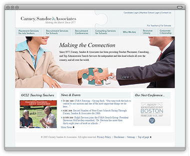
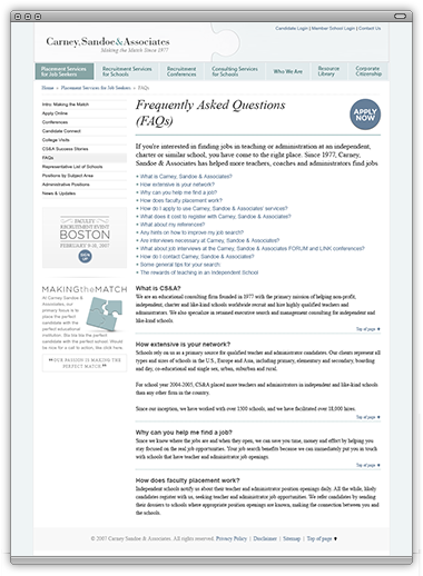
Carney Sandoe & Associates needed a complete redesign as their current design was patched up from previous iterations. We began by reorganizing the information to better reflect the aim of the company (which is to marry schools and people who work at schools) as well as account for a better degree of flexibility. One of the requirements was to pull back on photography. They felt like many of the images on the existing site were generic and repeated too often. Since there wasn’t a budget to accommodate a large image database, I tried to compensate by bringing the typography more to the foreground—both system text and image headers.
I Chose Times Oblique to correspond to their logo for a header/subheader font, while sticking with Times for the body copy. Another way I compensated for lacking photography was to create small internal advertising pieces. Here I chose Gotham Rounded (what a beautiful face!) and used light-colored accents to give the page a bit of variety.
Lastly, the client was adamant about using a puzzle motif. The current execution was a bit off because they were only showing one puzzle piece. I chose to show two inter-locking puzzle pieces to illustrate in a clearer manner how their organization brings two entities together.
Overall, I was very excited with this project. It was an excellent example of problem-solving with few resources and still ending up with a beautiful and usable web site.
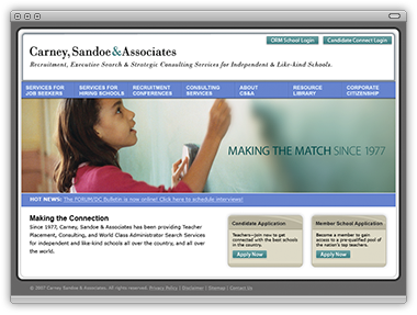
In the end, the client decided to axe the initial redirection and stick to their existing layout, just cleaning up some of the existing inconsistencies.
BEEMO uses Apple products & runs Textpattern on a Dreamhost server.
It's 18:42 , have a nice day!


