Hello, my name is…
Elsewhere
Flickr Photographs
View slideshow in the PHOTO section.
Facebook Connect
{dead}
Subscribe to Feeds
There's a variety of RSS feeds available for you to subscribe to in order to get the latest updates at BEEMO. The TEXT feed are the main entries. The FOLIO feed are entries into my graphic design portfolio. The PHOTO feed are my latest photographs. And for a the latest sites I've bookmarked, try the Currently Clicking feed.
Browse by Tags
Currently Clicking
Here's the Top 5 most recent bookmarks. The full list is at del.icio.us/beemo.
Sponsored Links
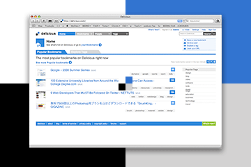
Del.icio.us redesign

So, my favorite bookmarking app got a redesign—and I like it, it’s fresh! Looks like the intent was a little less Googley, more super-saturated Web 2.0ish with a few design cues from our stylemasters at Apple. Ok, fine—I’ll buy it. The one thing that’s really bothered me about delicious all these years is their identity. The mark of the 4 different colored squares is nice and minimal, so it satisfies “that” part of my brain. Then, we have their name, which is so fun and playful. However, the two solid brand directions don’t relate at all. I really wish they’d either lose one angle or the other and make it all come together.
BEEMO uses Apple products & runs Textpattern on a Dreamhost server.
It's 08:26 , have a nice day!


