Hello, my name is…
Elsewhere
Flickr Photographs
View slideshow in the PHOTO section.
Facebook Connect
{dead}
Subscribe to Feeds
There's a variety of RSS feeds available for you to subscribe to in order to get the latest updates at BEEMO. The TEXT feed are the main entries. The FOLIO feed are entries into my graphic design portfolio. The PHOTO feed are my latest photographs. And for a the latest sites I've bookmarked, try the Currently Clicking feed.
Browse by Tags
Currently Clicking
Here's the Top 5 most recent bookmarks. The full list is at del.icio.us/beemo.
Sponsored Links
IDEO's new site
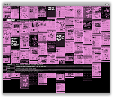
Of all the palindromic words I know to express my feeling of IDEO’s new site design—WOW comes to mind. What a fantastic site! The homepage has a really nice opening quality, the navigation might wander from the “typical,” but it’s hard to get lost due to the crystal clear breadcrumbs (among other hints).
Like anyone else, I have a few personal preferences I’d change. I’m a rectilinear-kind-of-guy, so the diagonals on the subsequent pages bother me a little bit, but not a deal-breaker. But I do “get it,” the twist on a blueprint, updated for the internet. This metaphor of handmade actually carries over to the presentation of images—see the other proofs in the background of the main image. The use of color in the navigation is a little difficult to follow since the global navigation doesn’t compliment this scheme, but doesn’t necessarily hinder any experience.
At any rate, the control they give a user is pretty damn close to unparalleled. With each page or article (whatever you call it), you can make a pdf, e-mail it, bookmark it to any number of bookmarking services. It really behaves as an application while maintaining a personality.
Without a doubt, one of the best sites I’ve seen released in the past few years.
![]() Posted on Tuesday, 02 Sep 2008
Posted on Tuesday, 02 Sep 2008
![]() Tags: agency,
ideo,
redesign,
site
Tags: agency,
ideo,
redesign,
site
BEEMO uses Apple products & runs Textpattern on a Dreamhost server.
It's 15:21 , have a nice day!


