Hello, my name is…
Elsewhere
Flickr Photographs
View slideshow in the PHOTO section.
Facebook Connect
{dead}
Subscribe to Feeds
There's a variety of RSS feeds available for you to subscribe to in order to get the latest updates at BEEMO. The TEXT feed are the main entries. The FOLIO feed are entries into my graphic design portfolio. The PHOTO feed are my latest photographs. And for a the latest sites I've bookmarked, try the Currently Clicking feed.
Browse by Tags
Currently Clicking
Here's the Top 5 most recent bookmarks. The full list is at del.icio.us/beemo.
Sponsored Links
Quirky Quark

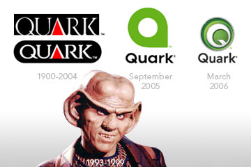
Back in September, Quark announced a departure of their existing logo and identity in exchange for a new, updated one. Well, the proverbial shit hit the proverbial fan when outraged designers cited that the new logo was a ripoff of around six different other brands. So, in response to the bitching and complaining from designers (who probably haven’t used Quark in 5 years anyhow), they put together yet another new logo.
 My initial thought is, “Geez, what a mess.” As I look at all three logos together, I kind of wonder why they changed the original logo in the first place. The new logo looks like a video game logo or something—the Hulk’s green eye popping out of a circle, I dunno. I do like how the tail of the “Q” is treated, but beyond the white, there are way too many concentric green circles around the damn thing. Also, the current palette is very reminiscent of
 Macromedia Adobe Dreamweaver, which is a little disappointing.
At the end of the day, what they should have done is used all the money from redesigning their logo and developed an OS X version of QuarkXPress back in 2001-2002, which is probably the whole purpose in “refreshing” the brand in the first place.
![]() Posted on Monday, 20 Mar 2006
Posted on Monday, 20 Mar 2006
![]() Tags: identity
Tags: identity
BEEMO uses Apple products & runs Textpattern on a Dreamhost server.
It's 09:12 , have a nice day!


