The Work
 Feed
Feed
Stay up-to-date with the latest works by subscribing to the FOLIO Feed.
Archived Work (off-site)
 If you want to see the really old stuff, visit BEEMO.org which includes the old Flash portfolio with work between 1997-2001, the BannerFactory™, and City Vans. By the way, the site you're at now covers work from 2002 to the present.
Download my Resume/CV
Feel free to download my current CV in PDF format.
One Digital poster

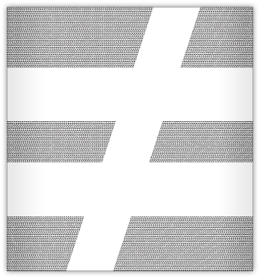
While at One Digital in São Paulo, I made a 2×3 meter poster for the studio as a branding piece. One Digital’s secondary logo/tagline was the “not equal to” sign (≠). One Digital: There is no equal.
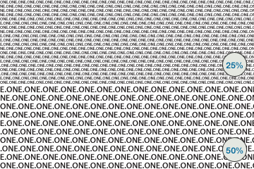
I began with the name of the studio in it’s simplest form (ONE.) and repeated it at a legible size if you were standing next to the poster. However, from afar the gaps would fill in and the reverse of the ≠ symbol would be the identifiable form. Also, the closer or farther away a person was, the more or less they would see repeated patterns appearing like waves (see detail below).
Since the studio was primarily an interactive shop, it was my goal to express this in a print environment. I feel like I accomplished this by fact that the poster would essentially “change” depending on how far or close the person was to the poster, and from both perspectives, the idea was always present.

![]() Work completed: February 2004
Work completed: February 2004
![]() Tagged as: illustration,
poster,
print
Tagged as: illustration,
poster,
print
BEEMO uses Apple products & runs Textpattern on a Dreamhost server.
It's 01:27 , have a nice day!
