The Work
 Feed
Feed
Stay up-to-date with the latest works by subscribing to the FOLIO Feed.
Archived Work (off-site)
 If you want to see the really old stuff, visit BEEMO.org which includes the old Flash portfolio with work between 1997-2001, the BannerFactory™, and City Vans. By the way, the site you're at now covers work from 2002 to the present.
Download my Resume/CV
Feel free to download my current CV in PDF format.
Waterman logo & site

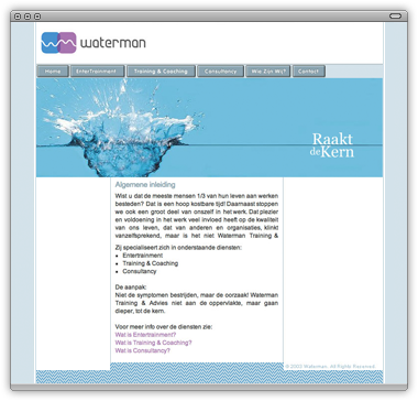
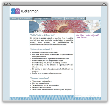
On a 2 month hiatus from living in Brasil, I worked closely with a good friend in Amsterdam to build a logo and website for a training company in the Netherlands called Waterman Training.
The client wanted a look to reflect the name of the company, something fluid, organic—a direct extension of the company’s methodologies in re-igniting productivity and satisfaction in the workplace. The other prerequisite was that the colors blue and purple be utilized.
Straight lines were kept to a minimum with the logo in order to draw on the amorphous qualities of water, as was the opacity of the blue and purple rounded squares. Conveniently for us, the “W” and “M” put together gave us a waveform. This form also indicates a business graphic—productivity being charted over time going up.
 The pixel pattern at the bottom of each page is a reproduction of the logo, or the waveform. Also, the difference in the pattern’s height gives us a “floodgate” image, as well as giving the page some depth. The overall layout was kept clean and easy to navigate, using a cool, pleasant color palette. Each page also has a short animation at the top which contributes to the overall fluidity of the site.


![]() Work completed: September 2003
Work completed: September 2003
![]() Tagged as: identity,
interface,
logo,
ui,
web
Tagged as: identity,
interface,
logo,
ui,
web
BEEMO uses Apple products & runs Textpattern on a Dreamhost server.
It's 07:10 , have a nice day!
