The Work
 Feed
Feed
Stay up-to-date with the latest works by subscribing to the FOLIO Feed.
Archived Work (off-site)
 If you want to see the really old stuff, visit BEEMO.org which includes the old Flash portfolio with work between 1997-2001, the BannerFactory™, and City Vans. By the way, the site you're at now covers work from 2002 to the present.
Download my Resume/CV
Feel free to download my current CV in PDF format.
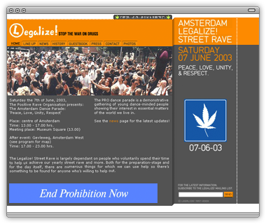
Legalize!

Against the advice of several of my peers, I have included this site
quite simply because I was overjoyed with the outcome. I worked with a Dutch studio to produce a site for a group of people in Holland dedicated to the legalization of, you know, the stuff in those funny little cigarettes.
That said, my goal was to design an interface that was “kinda flat” and “kinda not flat.” There’s a bit of isometric, pixel-by-pixel 3D up in there, however, the grid is pretty simple with only 2 different background colors.
![]()
One of my favorite parts of this site was the main navigation. The links are somewhere between buttons and tabs, but really are their own thing. It was my intention to take away small parts of what we all recognize as buttons/tabs and leave the main part intact. This way, there is still the relationship and level of comfortability in recognizing these things as primary navigation, but slightly different in order to (hopefully) appreciate something new.
There are other small details which I think really added character to the whole site. The search box’s default white background so close to the bottom of the dark grey interface gives it a little dimension. As does the white, dotted vertical line on the far right. From one perspective everything appears to be connected, another view seems like there’s a big orange/grey interface slapped onto a white background. Overall, I think it was a cool little site!
A quirky horrible, archived version can be seen here.
BEEMO uses Apple products & runs Textpattern on a Dreamhost server.
It's 10:07 , have a nice day!
